Your brand identity must strike your customers mind and remain their first choice when they are looking for a similar product.
LOGO DESIGN TIPS
Have you ever memorized a company’s logo by its exact brand name ? Have you subsequently been able to identify the company’s website thanks to its logo design characteristics ? Here is where logo design tips step in and reveal all their powers.
Hence, quite a lot of people experience this situation. Furthermore, the first move is usually to look at the brand name online (as long as you remember the name). If you are lucky enough to remember the name, then you can have a look at the “images” tab on your search result pages to identify its visual identity.
Some entrepreneur say that a website or logo design is not needed and some others state that it is crucial. We decided to write a short article on logo design tips because we are persuaded that a quality logo design will increase your business visibility and connecting process.
HOW TO CREATE THE IDEAL LOGO?
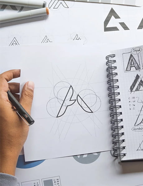
To begin with, there is nothing more rewarding for a graphic designer or entrepreneur than knowing that a logo captures the consumer’s attention. To this end, we tried to gather key aspects of logo design tips to implement when designing your logo.
There are countless articles on this subject. However, the purpose of this one is to share our experience (as a digital & creative studio) in regards to logo creation.
Hence, find below some important elements to take into account when creating a logo :
- « Too many colors blind the eyes ! ». Therefore, choose two colors (or a maximum of three). The colors should ideally call out the core of your business. For instance, the color red has a connotation associated with action, energy, determination and « popular ». However, be careful when using gradient colors. They must be properly measured when creating a logo. Examples of logos that follow this rule : Chiquita; Lego; Monopoly; Kärcher; Hornbach; Bodum; IKEA; FedEx; HP; Shell; Starbucks and many others.
- Colors and typography : when initially choosing colors and typography, make sure that they match the possible extension of your range or assortment. Example : If you create a brand of clothing for small girls with a raspberry colored logo and you then want to extend your brand to small boys, the color may not be appropriate. So choose an «all-purpose» color.
- Don’t add too many « embellishments » to your logo. Otherwise, the impact of the logo may not get the expected effect. You can stay in the subtlety without adding too many graphical features. Most logos that people remember contain one or two words, few colors and basic shapes.
Readability of your logo! Make sure that your logo is legible! Even from a distance ! and use short, memorable words.
«Keep it simple ! » – this formula, often used in marketing, also prevails for logos. Don’t be afraid to focus on something simple. Indeed, quite often one gets confused on the right logo to use if too many logo variation are suggested by a graphic designer.
- Be careful of the proportion of elements in your logo. The more importance you give to a feature, the larger it will appear but it should remain proportional. Example : no dog with a disproportionate head !
- Add dynamics or movement to the logo? why not ! However, do not make the mistake of wanting to add too many moving elements. Indeed, it is known that a static logo is more easily memorable than a moving logo. Example : ATP Tour; PMU logo; NRG radio
WHAT ABOUT A LOGO FOR A PREMIUM BRAND ?
Now, it’s time to talk about logos for premium or luxury brands. Indeed, the latters have their own rules. To help you with a few basics, we made up below non-exhaustive list :
Black and metallic colors (silver or gold) often prevail for luxury brands. Indeed, they convey a feeling of wealth, success, prosperity, sophistication or elegance. Color combinations are rarely used and the color of the writing used is mostly : black. Rolex or Tag Heuer have mixed two colors into their brand identity but they have not exceeded two colors. Example : Cartier; Jaguar; La Prairie; Hermès; LVMH; JBH
Background : there are few luxury brand logos that have a background (or image) behind the font. However, graphic designers prevail a writing without background.
Typography : Nowadays, a large majority of luxury brands use and focus on « typography » to stand out. Nevertheless, there is nothing better than being able to have a custom-made typography. But this requires a certain budget and is not within everyone’s reach. Join the «minimalist » wave while choosing a typography that makes you unique! Example : Thierry Mugler; Yves-Saint-Laurent; Balmain; Cartier, Rolex, etc.
Font : it should be classy and sophisticated at the same time. Furthermore, the thickness of the font line can vary (from thin to large). Example : Channel or Dolce & Gabbana
Names of cities : luxury brands often include the name of the city they originated from in their logo. Example: Milano; Paris; London; Dubai
IMPORTANT INFORMATION TO SHARE WITH YOUR GRAPHIC DESIGNER WHEN CREATING YOUR VISUAL IDENTITY
Finally, remember that your logo is only part of the development of your brand. In addition, visual identity and branding are strong and essential elements in the design of a brand. We will write an article on this subject and invite you to discover it in our « BLOG » section.
Above all, we’d like to share with you a short list of elements, which seems important to us, when deciding to have a logo created by a creative agency. In that sense, find below a series of information to communicate to your graphic designer when creating your logo. This is to facilitate the agency work and the related result :
1. Describe the feeling that your logo should inspire to the target audience. What is the value of the brand with which the public must identify? Example : a sense of sovereignty or prosperity? A sense of belonging to a popular community or a charity?
2. Describe how you see your brand evolving in the future. For instance : will you diversify into other types of activities? Example : Zara (clothing)/ Zara Home ; H&M (clothing)/ H&M Home
3. List your favourite colors. This allows designers to favour a color if they hesitate between two colors. If you favorite color is among the remaining choices, they might favor it.
4. Feel free to send examples of logos that you particularly like. This allows the designer to get an idea of how you imagine positioning your brand.
5. Carefully choose your words when describing to your designer the emotional and visual goal of your brand logo. For example, you might imagine a premium brand with minimalist letters but your designer might look to outstand your logo with luxury patterns or colors. Sometimes the dialogue is not on the same page and as a client, take time to define what you mean with each words you share in the brief. Words and emotions are very important when designing a brand identity. A professional designer will adjust his design type and process according to your scope
A designer is a planer with an aesthetic sense
Bruno Munari


